Python Matplotlib Library
Introduction:
Matplotlib is a Python 2D plotting library which produces publication quality figures in a variety of hardcopy formats and interactive environments across platforms. Matplotlib can be used in Python scripts, the Python and IPython shell, the jupyter notebook, web application servers, and four graphical user interface toolkits.
Matplotlib tries to make easy things easy and hard things possible. You can generate plots, histograms, power spectra, bar charts, errorcharts, scatterplots, etc., with just a few lines of code
For simple plotting the pyplot module provides a MATLAB-like interface, particularly when combined with IPython. For the power user, you have full control of line styles, font properties, axes properties, etc, via an object oriented interface or via a set of functions familiar to MATLAB users.
Installation:
In debian or Ubuntu systems, you can install matplotlib using
|
1 |
sudo apt-get install python-matplotlib |
or use yum in fedora or Redhat:
|
1 |
sudo yum install python-matplotlib |
For more installation guidelines, check out https://matplotlib.org/users/installing.html
Let’s get started!
Let’s import matplotlib
|
1 |
>>> import matplotlib.pyplot as plt |
Let’s draw a simple graph
|
1 2 3 4 5 |
>>> plt.plot([1,2,3,4]) >>> plt.ylabel('some numbers') >>> plt.show() |
You obtain the following figure 1
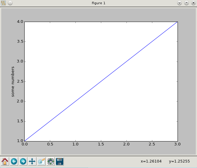
How did python decide the x axis values?
If you provide a single list or array to the plot() command, matplotlib assumes it is a sequence of y values, and automatically generates the x values for you. Since python ranges start with 0, the default x vector has the same length as y but starts with 0. Hence the x data are [0,1,2,3].
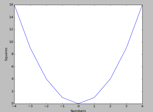
Sample Question:
Draw the graph of y=x2
Program:
|
1 2 3 4 5 6 7 |
>>> plt.plot([-4,-3,-2,-1,0,1,2,3,4],[16,9,4,1,0,1,4,9,16]) >>> plt.ylabel('Squares') >>> plt.xlabel('Numbers') >>> plt.show() |
Output:
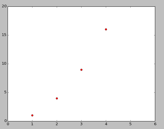
Now lets say you wanted red dots instead of lines of say a graph y=5*x
|
1 2 3 4 5 6 7 |
>>> plt.plot([1,2,3,4], [1,4,9,16], 'ro') >>> plt.axis([0, 6, 0, 20]) [0, 6, 0, 20] >>> plt.show() |
You get the following graph
MatPlotLib is not limited to just using list. Usually it is used in combination to numpy, and hence it has varied effective uses that makes analysing large amount of data easy.
Benefits of MatPlotlib:
- Rapid prototyping
- Research code
- Large numerical or matrix computations
- Data analysis
- FREE when compared to the huge cost of MATLAB, it rules!
For more of matplotlib like drawing histograms or multiple graphs on a single plot etc, check out https://matplotlib.org/users/pyplot_tutorial.html
For more examples, check out https://matplotlib.org/examples/index.html
Checkout matplotlib cheatsheet at following link:
https://www.globalsqa.com/data-visualisation-in-python-matplotlib-cheat-sheet
Have fun with matplotlib!
Leave a Reply